


Metal vs Acrylic Reception Signs: Pros, Cons and Best Use Cases
- January 21st, 2026
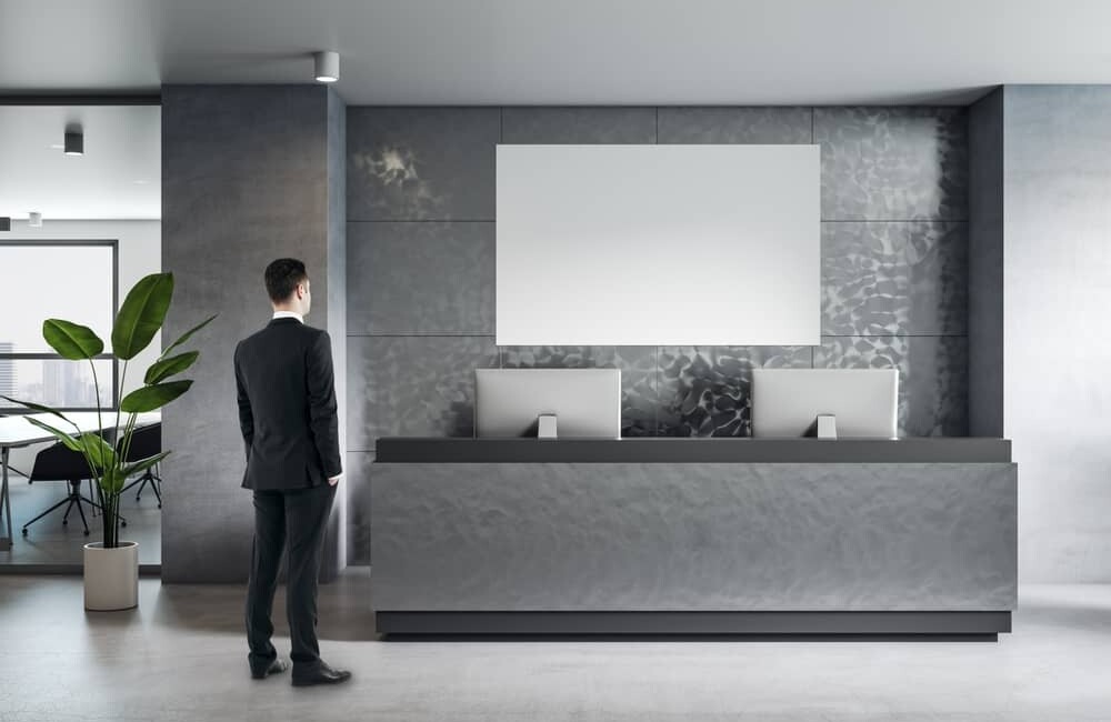
Your reception area does a lot of heavy lifting. It’s where first impressions are formed, where people decide (often in seconds) whether your business feels polished, trustworthy, and “put together”. And right at the centre of that moment is your reception sign.
Two of the most popular choices for modern reception signage are metal and acrylic. Both can look premium. Both can be fabricated in a stack of finishes. Both can be installed in a way that feels architectural and intentional.
But they behave very differently in real life. So if you’re weighing up metal vs acrylic reception signs for your Melbourne business, here’s a clear, detailed breakdown of what each one does best, where each one can fall short, and how to choose with confidence.
(And yes, Swift Signs designs, manufactures, and installs reception signage end-to-end, so you can keep the whole process simple.)
What counts as a “metal” or “acrylic” reception sign?
Before we compare, it helps to define what we’re actually talking about, because “metal sign” can mean a few different things.
Metal reception signs typically include:
- Aluminium (lightweight, versatile, common for signage)
- Stainless steel (sleek, durable, often brushed)
- Brass or bronze-look finishes (high-end, classic, often used in corporate and hospitality spaces)
Metal signs are usually flat-cut letters, laser-cut logos, or fabricated 3D lettering, mounted directly to the wall or installed with stand-offs.
Acrylic reception signs typically include:
- Clear acrylic (often called Perspex in Australia) with printed graphics or vinyl
- Frosted acrylic for a softer, more “diffused” look
- Coloured acrylic (solid, or layered with other materials)
Acrylic signs are often made as a backing panel (with logo/letters applied to it) or as 3D acrylic letters. Acrylic is widely used in rigid signage because it’s easy to process and comes in many thicknesses and finishes.
Metal reception signs: the real pros and cons
Why people love metal in reception areas
1) It looks instantly premium
Metal has weight, texture, and presence. Even minimal designs can feel high-end because the material itself does the talking.
2) It lasts and holds its shape
Metal (especially aluminium and stainless steel) is stable and long-wearing in indoor commercial environments. Aluminium is particularly popular because it’s durable and handles exposure well over time.
3) Finishes are very flexible
You can go brushed, polished, matte, powder-coated, painted, or layered. If you want signage that ties in with door hardware, light fittings, or a brand colour palette, metal gives you lots of options.
4) It works beautifully as 3D lettering
If you want your logo to “pop” with depth, metal fabricated letters can look sharp and architectural. (If you’re considering flat-cut vs 3D lettering, it’s worth thinking through whether the extra depth is worth the cost and visual impact.)
Where metal can be a tricky choice
1) It can be higher cost upfront
Between material cost, finishing (like powder coating), and fabrication, metal signage is often a bigger investment than acrylic.
2) Reflections can be a problem
Polished metals can bounce light in bright foyers. If you have strong downlights or lots of natural light, consider brushed or matte finishes.
3) Some metals show fingerprints easily
This is especially true for darker metals or polished finishes. If your reception sign sits near a walkway where people might touch it, this is worth factoring in.
Acrylic reception signs: the real pros and cons
Why acrylic is a favourite for modern fit-outs
1) It looks clean, glossy, and contemporary
Acrylic is popular for reception signs because it can look sleek and “new” without needing a huge budget. It’s a common choice for office and indoor display signage for exactly that reason.
2) It’s lightweight and versatile
Acrylic panels and letters can be mounted in many ways, including stand-offs (for a floating look) or flush mounting for a minimalist finish.
3) You can layer it for a designer feel
One of acrylic’s best features is layering:
- clear acrylic panel + printed logo
- frosted acrylic + metallic vinyl
- coloured acrylic letters on a contrasting wall
It can look surprisingly premium when designed well.
4) It plays nicely with lighting
If your reception space has feature lighting or you want subtle illumination effects, acrylic can help create a softer visual finish than reflective metal.
Where acrylic can fall short
1) It can scratch if cleaned incorrectly
Acrylic generally needs more gentle cleaning than metal. Harsh cloths or abrasive cleaners can leave fine scratches or dulling over time.
2) It’s not the best for high-impact areas
In a busy environment where things get bumped (think trolleys, bags, kids, deliveries), acrylic is more likely to chip or crack than metal.
3) It can look “too shiny” in some interiors
That high-gloss look is a plus for modern brands, but it can clash in heritage spaces or more muted, natural fit-outs.
Best use cases: when metal wins, when acrylic wins
Here’s the practical part most business owners actually want.
Choose a metal reception sign when:
- You’re a professional services brand (law, finance, consulting) and want a solid, established feel
- You want 3D fabricated letters that look architectural and high-impact
- You have a high-traffic reception area and need something more resistant to everyday wear
- Your interior style leans industrial, corporate, luxe, or minimalist
Choose an acrylic reception sign when:
- You want a modern, clean look at a more accessible price point
- Your brand leans tech, beauty, wellness, creative studio, allied health
- You like the idea of a panel sign with layered finishes (especially clear or frosted acrylic)
- You want flexibility to refresh the look later without a major refit
The decision factors most people forget (but shouldn’t)
1) Your wall surface matters more than you think
Plaster, concrete, timber slats, feature tiles, acoustic panels, rendered brick, all of these affect:
- how signage can be fixed
- whether stand-offs will sit cleanly
- what shadows will look like behind raised letters
Acrylic panels can hide small imperfections more easily. Metal letters often look best on very clean, flat surfaces.
2) Lighting can make or break the final look
Downlights can create dramatic shadows behind raised lettering. That can be gorgeous or messy depending on spacing and placement.
If you’re considering illumination, it’s worth also reading about illuminated vs non-illuminated signs because it changes how materials look in different lighting conditions.
3) Branding isn’t just colour. It’s texture.
Metal communicates “established, premium, confident”. Acrylic often communicates “fresh, modern, friendly”.
Neither is better. It’s about matching the feeling you want customers to walk away with.
Common questions
“Which is more expensive, metal or acrylic?”
In most cases, metal costs more upfront, especially if you’re doing fabricated 3D letters or specialty finishes. Acrylic is often more cost-effective, particularly for panel signs or simple 3D acrylic letters.
The more accurate question is: what’s your cost per year of use?
If you expect to keep the signage for a long time and you have a busy reception area, metal can be better value long-term.
“Do acrylic reception signs yellow over time?”
In indoor reception areas, quality acrylic generally performs well, but it still needs correct cleaning and care. UV exposure and harsh chemicals are more likely to cause issues.
“Can both materials work with stand-offs?”
Yes. Both metal and acrylic can be installed with stand-offs for that floating, premium look. The best option depends on wall type, size, and how much depth you want.
“What if I want the best of both?”
That’s often the smartest answer.
Popular hybrid approaches include:
- Acrylic backing panel + metal letters
- Metal panel + acrylic raised logo
- Acrylic panel + brushed metal-look vinyl or layered acrylic elements
You get the clean structure of a panel sign with the depth and texture of premium lettering.
A quick note on reception signage strategy
If you’re thinking “this feels like a lot for one sign”, you’re not wrong. Reception signs are one of the few pieces of signage customers will see up close, at eye level, while they wait. That’s why they can genuinely influence perception, trust, and brand recall.
And if you’re working through signage decisions more broadly (not just reception), Swift Signs has a helpful breakdown of sign materials and how to choose based on durability, budget, and location.
So, which should you choose?
If you want maximum longevity, weight, and a premium feel, metal is hard to beat. If you want a sleek modern look, flexibility, and strong visual impact without stretching the budget, acrylic is a brilliant option. And if you want the most custom, most “designed” result, combining the two often delivers the best outcome.
Swift Signs can help you choose the right material, design the sign to suit your space, then manufacture and install it as a complete service.
If you’re ready to upgrade your front desk and make your first impression feel intentional, talk to us about a custom reception sign that suits your brand, space, and budget.