


The Top 7 Mistakes People Make When Designing Banners for Printing (And How to Avoid Them)
- February 26th, 2026
A well-designed banner can attract attention in seconds. Whether it’s for a retail sale, school event, trade show, construction site or corporate promotion, banners remain one of the most effective forms of large format advertising.
But we often see businesses invest time and money into a design, only to be disappointed when the printed banner doesn’t look how they expected. Colours appear dull, text is hard to read, or the message feels cluttered. The good news is that most of these issues are avoidable.
If you’re planning on using banner printing, here are the top seven mistakes to avoid and what to do instead.
1. Designing in the Wrong Size or Scale
One of the most common mistakes is designing a banner without setting up the correct dimensions from the start.
Designing at A4 size and then scaling it up to 3 metres wide will almost always result in poor image quality. Fonts may look fine on your laptop screen, but once enlarged, everything can appear distorted.
How to avoid it
Start your design at the exact finished size of the banner, or at least at scale with the correct proportions. If you’re unsure about dimensions, speak with us before you begin. We’ll confirm the final size and layout requirements so your artwork is set up correctly from day one.
This is especially important for large outdoor business signage or event banners where visibility from a distance matters.
2. Using Low-Resolution Images
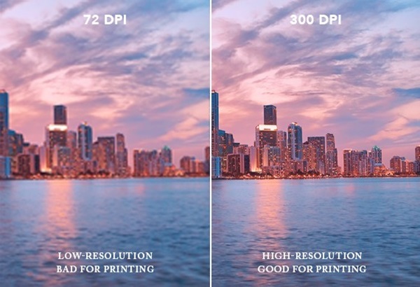
Images that look sharp online are not always suitable for print. Many website images are only 72 DPI, which works for screens but not for large format printing.
When printed at scale, low-resolution images appear pixelated or blurry. This can undermine the professionalism of your brand.
How to avoid it
Use high-resolution images at 300 DPI where possible, or at least ensure they are suitable for large format printing. If you’re not sure, send the files through to us. As an experienced signage company in Melbourne, we can check image quality before production and advise if changes are needed.
For logos, always use vector files such as AI, EPS or PDF. These can be scaled without losing quality.
3. Choosing Fonts That Are Hard to Read
Banners are designed to be read quickly. If someone has to stop and concentrate to understand your message, it’s not working.
Thin scripts, decorative fonts or overly compressed text can be difficult to read, particularly from a distance.
How to avoid it
Keep fonts bold, clear and simple. Prioritise legibility over style. A good rule is to step back from your screen or print a small test and check if you can still read it easily.
For outdoor banners and business signs, we often recommend strong sans-serif fonts and high contrast between text and background.
Remember, less is more. A banner is not a brochure. Focus on one strong message.
4. Overcrowding the Design
Another frequent issue is trying to include too much information.
Phone numbers, email addresses, social media icons, taglines, product lists, logos and images all competing for attention can overwhelm the viewer. Instead of standing out, the banner becomes confusing.
How to avoid it
Ask yourself what the single most important message is. Is it a sale? A grand opening? A website? A phone number?
Highlight that first. Supporting information should be secondary and spaced properly. White space is not wasted space. It improves clarity and makes the banner easier to read.
We apply this principle across everything from retail signs Melbourne to large-scale pylon signs. A clear, focused message always performs better.
5. Ignoring Viewing Distance
A banner inside a shopping centre will be viewed differently to one placed roadside or high on a building.
Designing without considering viewing distance can result in text that is too small or elements that get lost.
How to avoid it
The further away the audience, the larger the text needs to be.
For example:
- Trade show banners viewed up close can use smaller text.
- Outdoor banners facing traffic need large, bold lettering.
- Construction site banners should prioritise brand name and key contact details.
When clients come to us for custom signs, we always ask where the banner will be displayed. Placement affects size, layout and even material choice.
6. Not Accounting for Bleed and Safe Margins
In printing, “bleed” refers to extending design elements beyond the final trim edge. Without proper bleed and safe margins, important content can be cut off.
This is particularly important for large banners with hems or eyelets. Text placed too close to the edge can disappear once finishing is applied.
How to avoid it
Allow for:
- Bleed around the edges
- A safe margin where no critical text or logos are placed
- Extra allowance for hems and eyelets
If you’re unsure, we can provide artwork templates for your specific banner size. As a provider of professional digital banner printing, we make sure your final product looks clean and correctly finished.
7. Choosing the Wrong Material
Design is only one part of a successful banner. The material matters just as much.
Using indoor vinyl for outdoor applications can result in fading, tearing or poor durability. Similarly, mesh banners are better suited for windy areas, while solid vinyl works well in more protected environments.
How to avoid it
Match the material to the environment.
For example:
- Outdoor events may require heavy-duty vinyl
- Building wraps may benefit from mesh
- Indoor promotions can use lighter materials
- Long-term installations may require UV-resistant finishes
At Swift Signs, we help clients select the right material based on usage, weather exposure and duration. This approach applies across our services, whether it’s banners, outdoor business signage, or even vehicle signs.
Bonus Tip: Not Proofreading Carefully
Spelling mistakes and incorrect phone numbers are more common than you might think.
Once printed, errors are costly to fix.
How to avoid it
Proofread multiple times. Ask someone else to review it. Double-check contact details, URLs and dates.
We also encourage clients to approve a final artwork proof before production begins.
Why Professional Support Makes a Difference
Many of these mistakes happen simply because people are not familiar with print requirements. Designing for screen and designing for print are very different.
Working with a professional signage company ensures:
- Correct file setup
- Suitable materials
- Clear, readable layouts
- High-quality print finishes
- Reliable installation if required
We’ve helped businesses across Melbourne with everything from event banners to long-term promotional signage. Our team reviews every file before production and offers practical advice to avoid costly reprints.
If you’re also exploring options like retail signage or larger format structural signage, you might find our blogs on retail and shop signage and pylon signs helpful for planning your next project.
Ready to Get Started?
Banners remain one of the most cost-effective marketing tools available. When designed properly, they can increase visibility, drive foot traffic and strengthen brand awareness.
The key is getting the fundamentals right. Correct size, high-resolution images, clear fonts, appropriate material and professional setup all play a role.
If you’re planning your next banner and want expert guidance, we’re here to help.
Contact us today for a free quote and let’s create signage that works as hard as you do.