


The Psychology of Colour in Corporate Signage: What Your Building is Really Saying
- May 28th, 2026
A company’s colour scheme can be just as memorable as their jingle, logo, slogan, or service. Here in Australia, you’ll find this strategy being used by some of the biggest corporations and brand names. CommBank, McDonalds, Coles, and 7-11 are just some of the most notable companies employing this very same strategy.
With this in mind, this article is going to break down the fascinating psychology of colour in corporate signage. From what your building is really saying to what customers are thinking, we’ll cover everything you need to know.
Why Colour Matters More Than Most Businesses Realise
Before someone walks through your doors, speaks to your staff, downloads your app, or visits your website, chances are they already have an impression based purely on visual cues. Without any shadow of a doubt, one of the strongest of those cues is colour.
The colours used across your building’s exterior, reception area, vehicles, and shopfront all shape how people are likely to perceive your company. From a psychological perspective, customers often make subconscious assumptions about professionalism, trustworthiness, pricing, and even service quality within seconds of seeing your signage.
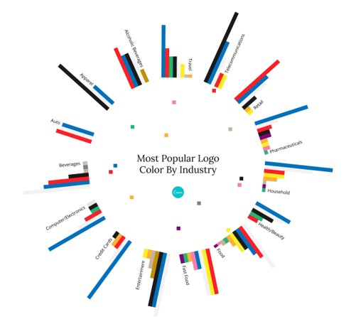
Source: Canva ‘Color psychology – The logo color tricks used by top companies’
Colour selection, however, isn’t necessarily just a matter of personal preference. A bold red sign creates a very different emotional reaction compared to muted charcoal tones or vibrant greens. Your signage becomes a silent communicator for your brand, constantly sending messages whether you intend it to or not.
What Different Colours Communicate
While every brand is unique, certain colour associations are deeply ingrained in consumer psychology. These associations often influence how customers interpret your business before they’ve even interacted with you.
Blue
Blue is one of the most widely used colours in corporate branding, particularly in finance, technology, and professional services. It’s associated with reliability, calmness, and confidence.
This is one reason many Australian corporations lean heavily into blue branding. It creates familiarity and communicates a sense of authority without appearing overly aggressive.
For corporate signage, blue works particularly well on office buildings, illuminated signs, and reception displays where professionalism is front and centre.
Red
Red is impossible to ignore. It creates excitement, urgency, and strong emotional reactions, which is why it’s commonly used in retail, hospitality, and fast-food branding.
In signage, red naturally draws the eye, making it useful for businesses wanting strong roadside visibility or a more energetic brand personality. However, too much red can feel overwhelming if not balanced correctly.
The key is using it strategically rather than saturating every element of your signage package.
Green
Green is often associated with nature, wellbeing, sustainability, and financial growth. Businesses wanting to communicate environmental responsibility or a fresh, modern image frequently incorporate green into their signage.
This colour has become increasingly popular across Australian industries focused on sustainability, wellness, landscaping, and organic products.
On buildings and outdoor signage, green also pairs naturally with contemporary architectural materials like timber, concrete, and matte finishes.
Black and Charcoal
Dark tones create a premium appearance when executed properly. Matte black signage with subtle illumination has become especially popular among modern offices, luxury retailers, architects, and high-end hospitality venues.
A recent Swift Signs project. View our full gallery right here online!
These colours communicate confidence and sophistication without needing excessive visual clutter. Combined with dimensional lettering or metallic finishes, darker colour palettes can make corporate signage feel polished and expensive in all the right ways.
Colour Consistency Builds Brand Recognition
One of the biggest mistakes businesses make is treating signage colours differently from the rest of their branding. If your website uses soft contemporary tones but your building signage feels loud and outdated, customers notice the disconnect immediately.
Strong branding relies on consistency across every touchpoint.
Your corporate signage should align with your digital branding, printed materials, vehicle graphics, uniforms, and interior spaces. This repetition helps customers recognise and remember your business over time.
Think about some of Australia’s most recognisable brands. Even without seeing a logo, most people can instantly identify certain companies purely through colour combinations alone. That level of recognition doesn’t happen accidentally.
The Impact of Colour in Different Environments
Colour doesn’t exist in isolation. The environment surrounding your signage plays a huge role in how colours appear and perform.
Natural lighting, nearby buildings, landscaping, weather conditions, and viewing distance can all affect visibility and readability. Colours that look great on a computer screen may feel completely different once installed on a large building facade.
For example, lighter colours may struggle against bright sunlight, while darker signs can lose visibility at night without proper illumination. Highly reflective finishes can also create glare issues depending on placement.
This is why professional signage planning matters. A colour palette needs to work not only with your branding but also with the physical environment where the signage will live.
The Value of Internal Signage
When businesses think about signage colour psychology, they often focus only on external signs. What many don’t realise is just how influential the right internal signage can be.
Reception signage, wayfinding systems, wall graphics, and branded office displays all contribute to the customer experience. Essentially, these internal touchpoints help to reinforce your company culture and brand personality once any visitors enter the space.
Warm colours can make hospitality spaces feel welcoming and energetic, while cooler tones often suit professional offices aiming for a calm and refined atmosphere.
Your signage package should also feel connected from the exterior of the building right through to the internal customer experience. If you have any questions about corporate signage, be sure to get in touch with us and speak with an expert!
Finding Colours That Actually Suit Your Brand
There’s no universal “best” colour for corporate signage. What works brilliantly for one business could completely miss the mark for another. If customers already have a strong colour association with your brand, there’s absolutely no need to change things up.
However, if you are considering something new, the right colour palette depends on several factors, including:
- Your industry and target audience
- The personality of your brand
- Your physical location and surroundings
- Visibility requirements
- Existing branding elements
- The type of signage being installed
At Swift Signs, we’re more than happy to work with your existing colour scheme, as well as adopt any of your marketing campaigns or corporate strategies.
Our Corporate Packages
Corporate signage packages can include vehicle signs, building signs, pylon signs, sign writing, building painting, and more. It’s all up to you!
Before starting any design and construction work, we meet with every client to gain a well-rounded understanding of their business, their brand identity, and their goals. Using this info, we establish the most appropriate corporate signage solution to fit your requirements.
Our skilled in-house design team can also create custom designs that incorporate existing corporate logos and style. Once the designs are approved, it’s passed onto our fabrication team for construction. Here, we use durable construction methods to create long-lasting, great-looking corporate signs.
After your business signs are completed, our experts will ensure that the installation process is smooth, safe, efficient, and stress-free.
Corporate Signage in Melbourne: Build a Stronger Visual Identity
The colours on your signage are communicating with customers every single day, whether you realise it or not. They shape first impressions, influence emotional responses, and contribute to how people remember your business long after they leave.
At Swift Signs, we help Melbourne businesses create corporate signage that balances visibility, functionality, and strong brand presentation. Whether you’re refreshing existing signage or planning a complete brand rollout, our team can help bring your vision to life with signage solutions tailored to your space and business goals.
From design and manufacturing through to installation, we create signage that speaks clearly for your brand.