


How-To Design Effective Wayfinding Signs for Healthcare Facilities
- August 15th, 2024
If you work in the healthcare industry or manage a hospital, clinic, or other medical facility, you know just how important clear signage and wayfinding is. With people coming and going in varying states of health, stress levels, and urgency, it’s very important that your signs effectively guide visitors, patients, and staff to their desired locations.
After all, the last thing you want is for someone to get lost or frustrated trying to find the emergency room, surgical wing, or their appointment. That’s just going to add unnecessary anxiety to an already tense situation. Fortunately, with some thoughtful planning and execution, designing wayfinding signage for your healthcare facility doesn’t have to be difficult.
Why Wayfinding Matters in Healthcare
Before jumping into the how-to’s, let’s chat about why wayfinding is crucial in healthcare facilities.
- Reduced Anxiety: Feeling lost in an unfamiliar environment can be disorienting. Clear signage helps people find their way quickly, reducing stress and anxiety for patients and visitors.
- Improved Efficiency: When people can find their destinations easily, it frees up staff time that would otherwise be spent providing directions. This allows staff to focus on what they do best – providing excellent patient care.
- Enhanced Patient Satisfaction: A positive first impression matters. Easy-to-understand wayfinding contributes to a sense of control and well-being for patients, leading to higher satisfaction scores.
- Accessibility for All: Well-designed signage caters to a diverse range of users, including those with visual impairments, mobility limitations, or language barriers. This promotes inclusivity and ensures everyone feels welcome.
Step-by-Step Guide to Designing Healthcare Wayfinding Signs
Now, let’s roll up our sleeves and get into the nitty-gritty of designing these signs.
Set Your Sign Strategy
As with any big project, you’ll want to start by getting clear on your goals, key messaging, and overall wayfinding plan. What are the main destinations and pathways people need to be guided to and from? Which areas need special instructions or accessibility considerations? And what is the overarching experience you want to create?
For a healthcare facility, the primary goals of your signage are:
- Directing traffic to key locations like entrances, parking, registration, emergency, patient rooms, operating rooms, pharmacies, cafeterias, etc.
- Improving accessibility with signage for those with disabilities, language barriers, and other needs.
- Enhancing safety with clear restrictions, hazard warnings, and instructions in critical areas.
- Providing a reassuring, professional experience that boosts your centre’s credibility and brand reputation.
With those objectives in mind, work with leadership, staff, and any signage professionals you’re collaborating with to map out your facility’s overall traffic flows and signage needs. Consider every type of visitor, from patients to doctors to delivery personnel, and account for their unique wayfinding requirements.
This big-picture planning stage will allow you to develop a consistent, cohesive signage system rather than a patchwork of disconnected signs.
Design Your Signs
When it comes to the actual design and execution of your signage, there are some universal principles and best practices to follow:
- Typography: Stick to clean, simple fonts that are highly legible, even at a distance or for those with vision impairments. Sans serif fonts like Helvetica, Franklin Gothic, and Frutiger work well. Avoid anything decorative or hard to read quickly.
- Colour: Stick to high-contrast colour combinations like black text on a white or yellow background. Reserve red for critical emergency signage. Incorporate your brand colours, but use them as accents rather than the main palette for crucial wayfinding.
- Messaging: Use short, direct phrasing wherever possible. Avoid full sentences and get right to the point. Only include additional instructions or details when absolutely necessary.
- Iconography: Incorporate easily recognizable symbols, icons and pictograms to supplement text. Just make sure their meaning is standardised and clear.
- Lighting & Placement: Signs should be well-lit and placed at key decision points like lobbies, hallway intersections, elevators, exits, etc. Don’t put them too high or obstructed from normal lines of sight.
- Materials: Choose highly durable materials that can withstand heavy use, cleaning products, and won’t easily fade, dent or peel.
- Consistency: Maintain the same typography, colours, icons, nomenclature and overall design style across all directional and identification signs within your wayfinding system.
- Accessibility: Follow local, and any other legal requirements for sign height, raised text/braille, character proportion, etc. to ensure maximum accessibility.
Craft Clear Messaging & Nomenclature
For the most part, you’ll want to use standardised medical terminology and naming conventions that healthcare professionals and frequent patients will recognise like “Operating Rooms”, “Radiology”, “Lab”, etc. However, for wayfinding, it’s also helpful to incorporate some plain language, such as “Birthing Center,” instead of just “Maternity Ward.”
Really think through how different audiences might look for or refer to locations. Ask staff for input on the terminology that’s most friendly and intuitive for your particular facility.
And keep in mind that in moments of potential emergency, anxiety or urgency, fewer words are better. So stick to very concise phrasing for critical directional signage.
Use Alphabetical or Coded Room Numbers
Most healthcare facilities use some sort of coded room numbering or naming system to organise departments. For example, rooms might start with OR (operating room), DR (doctor’s office) or a floor number.
Whatever your numbering convention, be sure to group areas together logically on signs and consider listing destinations alphabetically. This makes it much easier to scan and find what you need.
Here’s an example:
Patient Rooms: 250-275
Pediatrics Rooms: 200-225
Implement Effective Colour-Coding
On top of numbering systems, many hospitals use unique colour-coding for various departments and procedural areas. For instance, blue might represent Cardiac Services while green is used for Pediatrics and so on.
This colour-coded system can provide helpful visual cues when incorporated into signs. Maybe all the text and icons for Cardiac Service signs use blue. You can take it a step further by colour-coding entire hallways or sections of the building, too.
Just be sure to use colours strategically, maintain consistent colour = location coding across your facility, and provide a map or directory sign that explains your colour system.
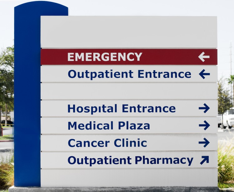
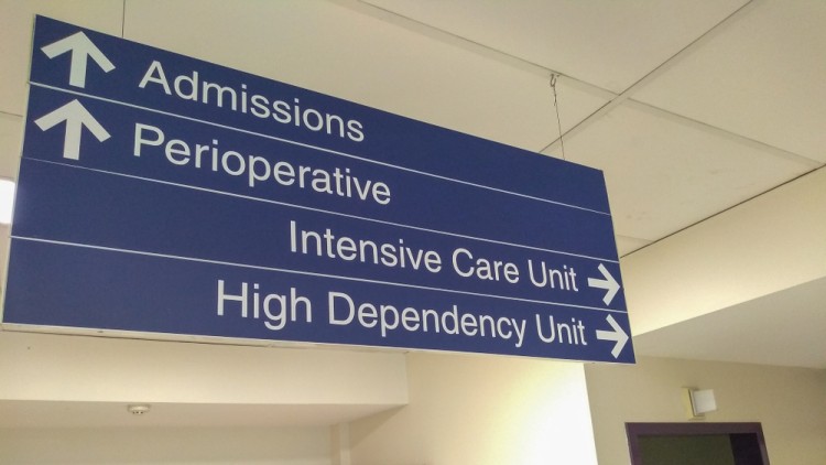
Add Clear Directional Cues
In larger buildings, hallways, lobbies and intersections can start to feel like a maze, so well-placed directional cues are essential in healthcare environments. Don’t make people guess where to go next!
Simple inverted arrows on hanging signs can indicate the direction of travel. Floor maps at elevator banks are also very helpful for getting oriented. And incorporating clear “You Are Here” markers on any facility maps is a must.
For external directional signage, like guiding people from parking lots and entrances, think bigger and bolder! Large, externally-illuminated directional totems and pylon signs stand out clearly, making them easy to spot and follow.
Looking for a 3D Illuminated sign, fabricated sign, or solar Illumination? Swift Signs can help. We can help you create a signage system that’s both functional and visually impressive.
Incorporate Clear Instructions
Any areas where instructions are critical should have easy-to-follow signs that break down guidance step-by-step. Think of places like:
- Surgical Prep Instructions
- MRI & Radiology Procedures
- Check-In Forms & Instructions
- Covid Testing/Screening Protocols
- Waiting Areas & Visitor Guidelines
Use numbers, symbols, and basic phrasing to walk people through any protocols in these areas. Well-designed signs will vastly improve communication, patient compliance and safety.
Consider Accessibility Needs
In addition to following Australian sign guidelines, you’ll want to account for people’s unique accessibility needs throughout your healthcare facility.
For instance, make sure high-priority areas of your wayfinding system include braille, high-contrast colours, lower mounting heights, and any additional accommodations required locally. It’s also a good practice to incorporate multi-lingual messaging for your patient population.
And for visitors with mobility limitations, it’s critical to clearly designate accessible pathways, entrances, parking, and any restrictions on where to travel. Be sure to use all relevant accessibility symbols and iconography from the get-go.
Safety & Hazard Signs
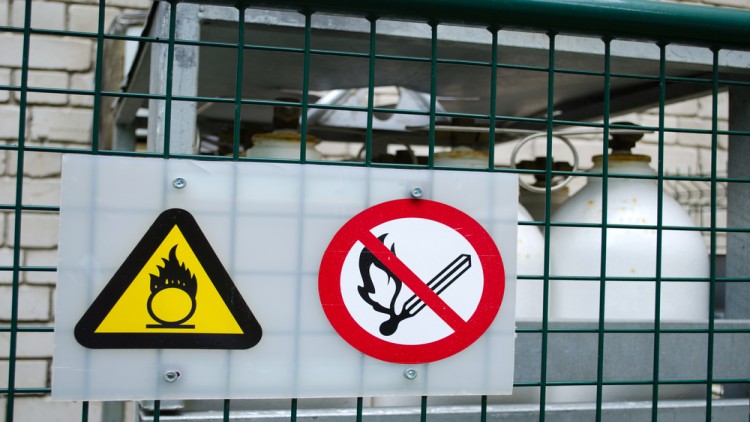
Part of any hospital wayfinding system needs to include clear safety signs, hazard warnings, and restriction signage for certain areas like:
- Biohazard & PPE Requirements
- Radiation Areas
- High-Noise Levels
- Authorised Staff Only
- No Entry/No Exit
- Visitor Check-In Protocols
- Emergency Instructions
These critical signs should use bold, high-contrast text and recognisable symbols that immediately grab people’s attention. Prioritise quick comprehension and use minimal text to communicate restrictions and warnings.
Implementation
Before you commit to a full rollout, it’s wise to test your designs. This could involve:
- Creating mockups or prototypes of your signs.
- Conducting user testing with a diverse group of people.
- Gathering feedback from staff, patients, and visitors.
- Making adjustments based on the feedback received.
Wayfinding Signs in Melbourne – How Can Swift Signs Help?
Looking for an experienced local signage partner to bring your healthcare wayfinding vision to life? At Swift Signs, we specialise in comprehensive wayfinding solutions tailored specifically to hospitals, clinics, and other medical facilities across Melbourne and Australia.
With over 60 years in the industry, our team has mastered techniques to create signage that delivers clear guidance and peace of mind. We listen carefully to each client’s unique needs, space requirements, branding and more to custom design every element of your wayfinding system. From strategic planning to sourcing quality materials to professional installation, we’ve got you covered every step of the way.
Our extensive signage offerings include pylon & directional signs, ADA-compliant colour-coded wayfinding, vehicle wraps & fleet Branding, hazard & safety signs, and so much more.
We’d be happy to provide you with a free consultation and sign plan tailored to your goals, budget, and space. Give us a call today on 03 9357 8299 or contact us here to get started.